
How to Build a Color Palette for Your Picture Book Illustration
Color is one of the most powerful storytelling tools in picture book illustration. Long before a child can articulate why a page feels exciting, calm, or overwhelming, they react to color. A well-designed palette guides emotion, supports the narrative arc, and creates visual consistency across an entire book.
If you’re illustrating a children’s book—whether digitally or traditionally—building a thoughtful color palette before you begin final illustrations will save time, strengthen your storytelling, and help your book feel cohesive from the first page to the last.
In this post, I’ll walk you through my complete process for building a picture book palette, using my own book Are You Bored? as a real example.
Why Color Palettes Matter in Picture Books
A picture book palette isn’t just about choosing “pretty colors.” It helps you:
Signal emotional shifts in the story
Guide the reader’s eye
Unify characters and environments
Maintain consistency across dozens of illustrations
Avoid visual overload for young readers
In Are You Bored?, the story moves from quiet frustration into imagination and creative play. I intentionally built a rich but controlled palette to support that journey—one that contrasts boredom with energy and curiosity.
Step 1: Start With the Story’s Emotional Arc
Before opening your color picker, ask:
What emotions dominate the beginning, middle, and end of the story?
Does the mood evolve or stay consistent?
Should the palette feel calm, energetic, cozy, chaotic—or a mix?
For Are You Bored?, the palette starts with softer, quieter tones and gradually introduces brighter, playful colors as imagination takes over. Thinking in emotional transitions, not just individual scenes, is key.
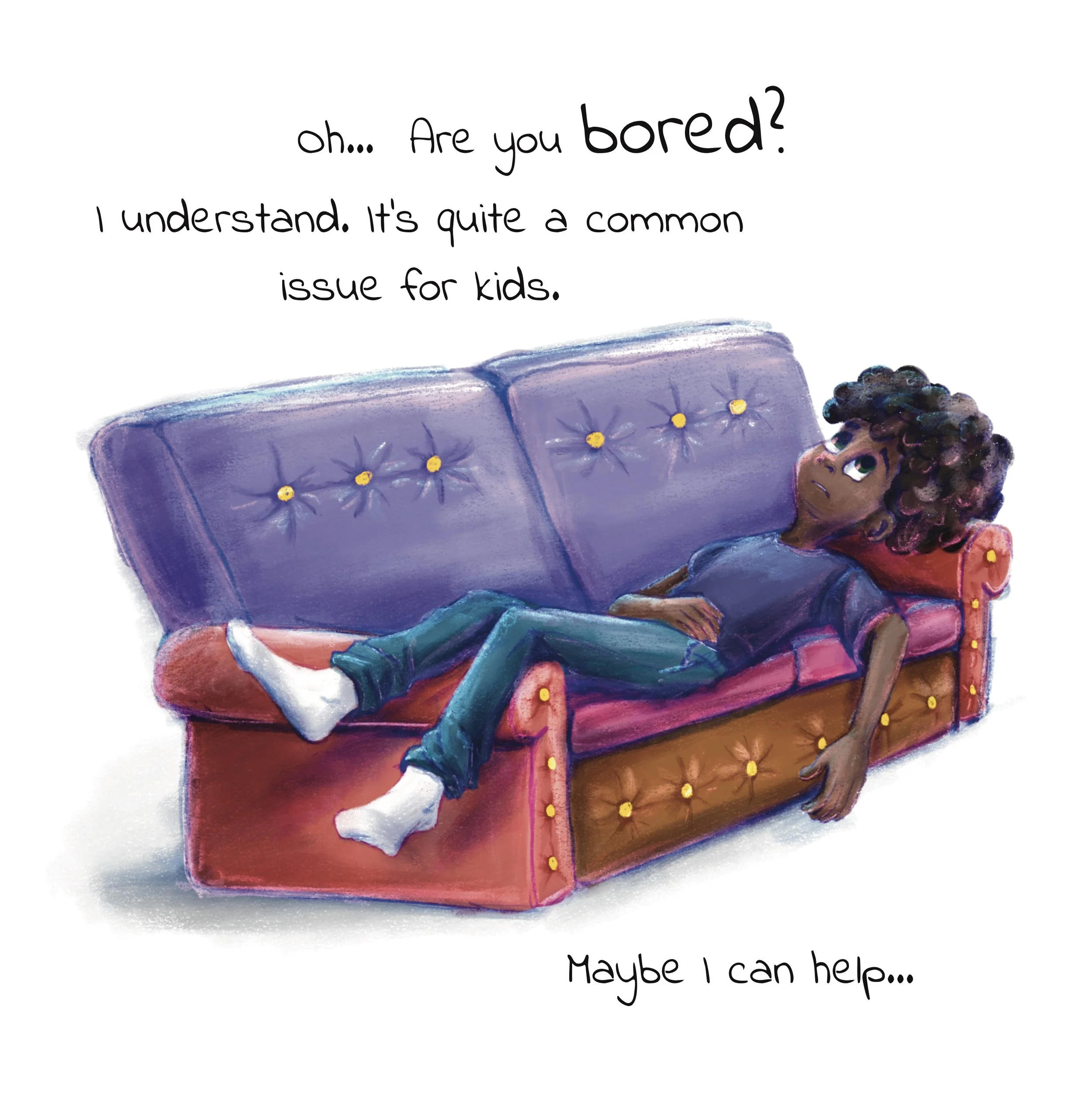
At the beginning of the book, boredom is quiet, heavy, and slow. This is reflected through cool, muted colors: soft purples, desaturated blues, and subdued greens. In the opening illustrations—such as the child lying on the couch or the three children standing together—colors stay close in value and temperature, creating a calm but emotionally flat atmosphere.
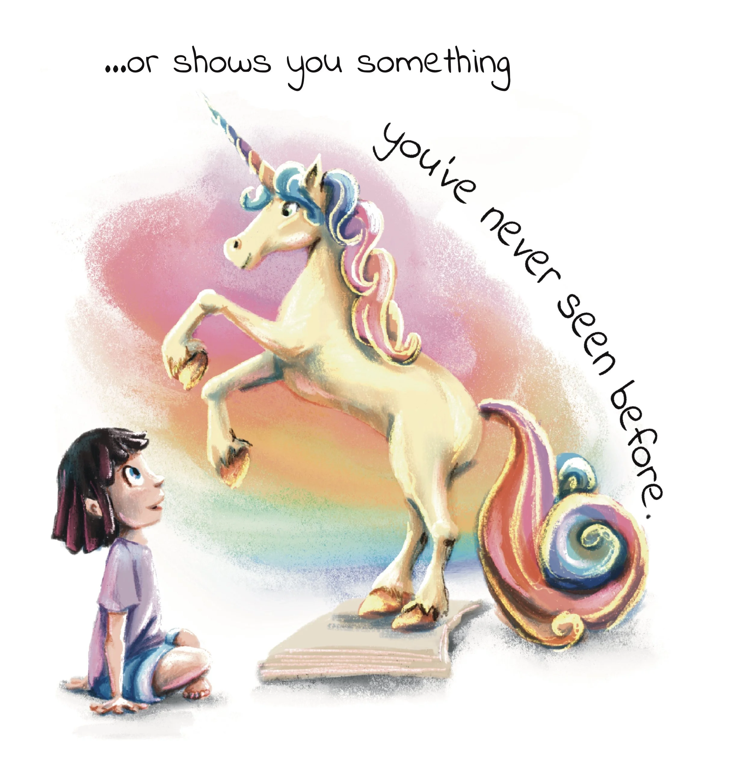
By contrast, the ending illustrations shift the mood entirely. Imagination is represented with warm pinks, yellows, and rainbow transitions, clearly separating emotional states without changing the characters themselves.
Takeaway for illustrators:
Decide your emotional range first. Ask:
Where does the story start emotionally?
Where should it end?
Then let color temperature and saturation carry that transition.
Tip: Write 3–5 emotional keywords for your book (e.g., quiet, restless, playful, warm). Let those guide every color decision.
Step 2: Build a Limited Base Palette (Your Visual Foundation)
I usually begin with 5–7 core colors that act as the backbone of the entire book. This base typically includes:
Main character colors (clothing, hair, skin tones)
One or two background neutrals (warm gray, soft beige, off-white)
One or two highlight colors for visual interest
A dedicated shadow tone
Limiting your base palette may feel restrictive at first, but it actually creates freedom. It speeds up decision-making and keeps every spread visually connected.
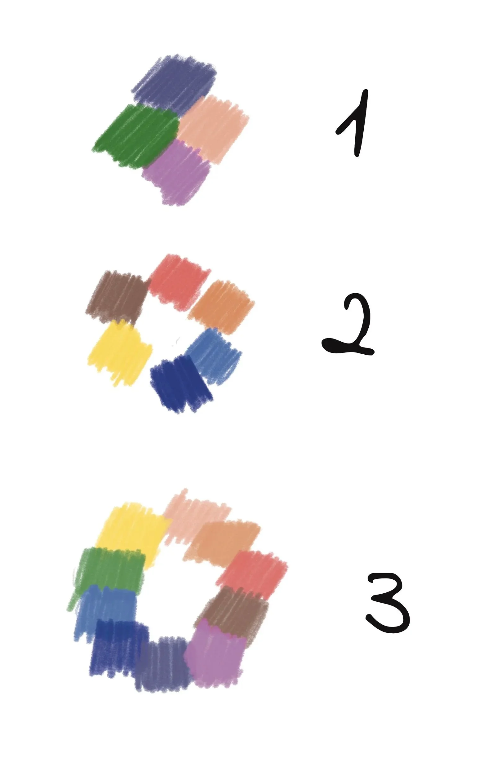
Across the entire book, the characters are built from a small, repeating set of base colors—teal, purple, green, soft peach—regardless of scene complexity. Even when environments change, these colors remain stable.
This restraint allows the reader to focus on story and expression rather than being distracted by constant color changes.
Takeaway for illustrators:
Start with:
Character colors
One or two background neutrals
A small set of accents
If everything can be painted using this base, the book will feel unified.
Step 3: Plan Lighting and Shadow Inside the Palette
Many illustrators treat lighting as an afterthought. I plan it directly into the palette.
For Are You Bored?, I included:
Shadow colors: desaturated purples and deep blues (used on Multiply layers)
Light tones: pale blues and pinks (used on Add or Screen layers)
This approach lets me create atmosphere and depth without introducing random colors that break consistency.
Ask yourself:
Can every shadow and highlight be created using colors already in my palette?
If yes—you’re on the right track.
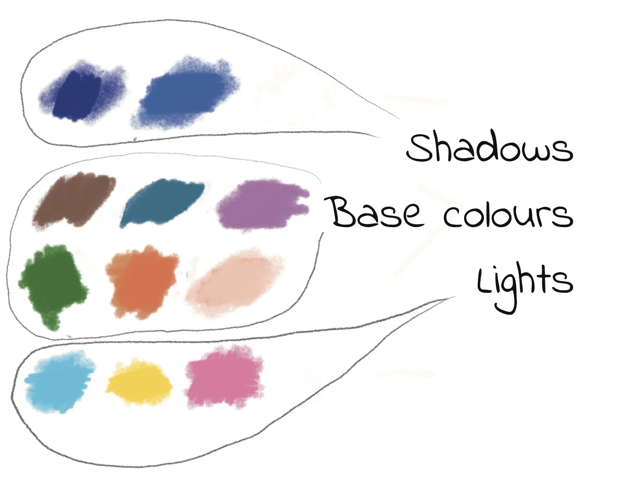
Shadows throughout the book are created using cool blues and purples, not black. Highlights lean toward pale pinks and light blues. This is visible both in the subdued couch scene and the brighter imagination scenes.
Because lights and shadows stay inside the palette, the illustrations feel soft and approachable—even when contrast increases.
Takeaway for illustrators:
Choose:
one shadow hue,
one light hue,
and reuse them everywhere.
This keeps depth consistent and child-friendly.
Step 4: Expand Carefully With Accent Colors
Children’s books often need variety—plants, toys, books, imaginative elements. I do introduce accent colors when needed, but I always:
Sample from existing palette colors
Adjust value or saturation rather than hue
Keep accents scene-specific, not global
Because Are You Bored? is intentionally colorful, I used white backgrounds paired with vibrant objects (toys, books, imaginative elements). For rainbow-like effects, I chose mid-light values and moved gradually around the color wheel—creating a secondary palette that still felt unified.
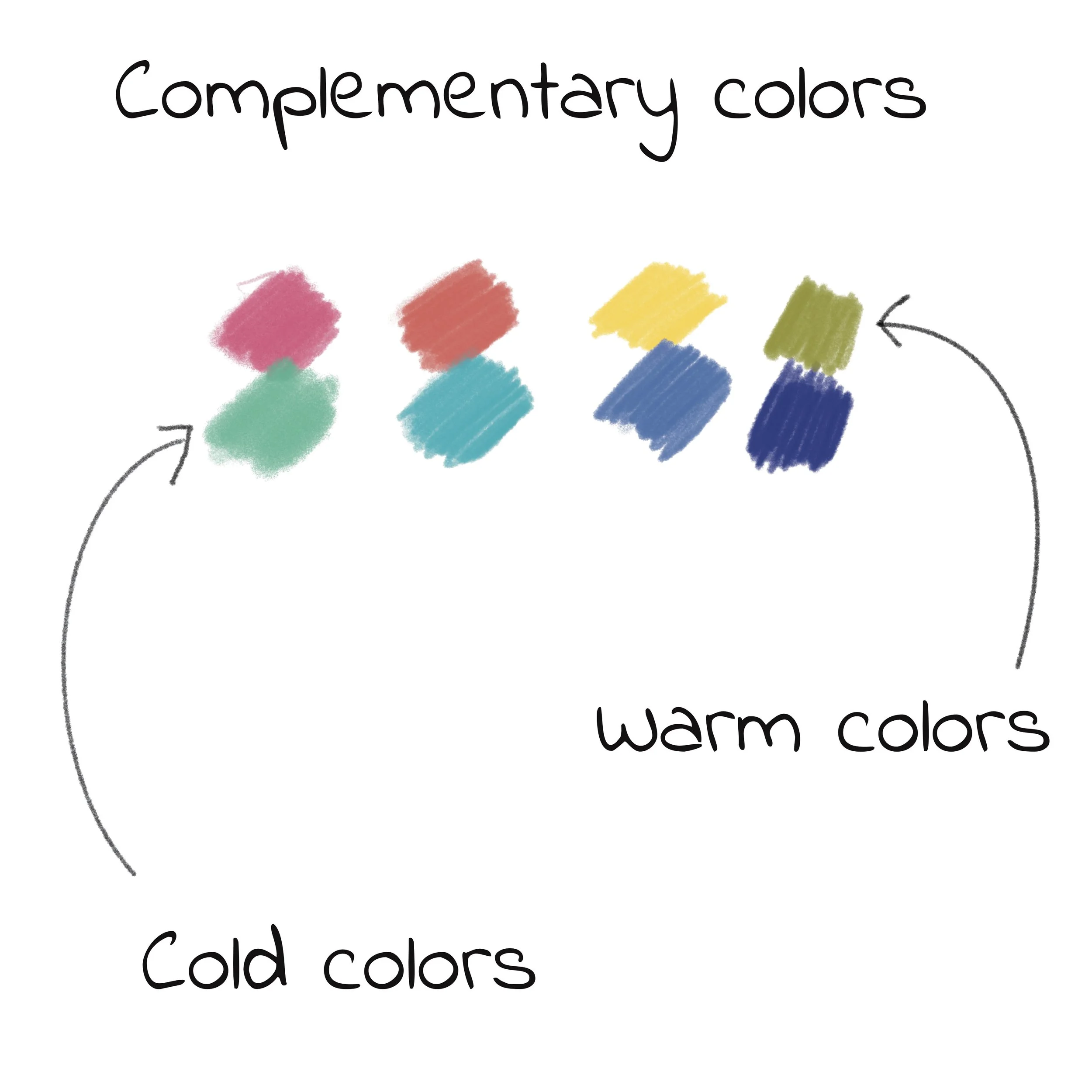
Complementary colors appear most clearly in the imaginative moments: warm yellows and pinks layered against cool blues and greens. These contrasts are not random—they appear exactly when the story shifts into creativity and discovery.
In the beginning illustrations, complementary contrasts are minimal. At the end, they become central.
Takeaway for illustrators:
Save strong contrasts for moments that matter.
Complementary colors are most powerful when they signal change.
Step 5: Test Before You Commit
Before finalizing a palette, I always test it on:
A character close-up
A simple background
One emotionally important scene
This small test reveals problems early: colors that clash, skin tones that feel off, or scenes that feel too busy for young readers.
The beginning of the book is dominated by cool tones, reinforcing stillness and boredom. Warm colors exist, but they’re muted and secondary.
By the end, warm colors take over—often placed centrally—while cool tones support them from the background.
Takeaway for illustrators:
Warm vs. cool isn’t about preference—it’s about emotional direction.
Decide which temperature leads each scene.
Bonus: Download My Palette
Want to try out the ‘Are You Bored?’ palette in your own work?
You can download my full color palette here - it’s free.
If you’d like to experiment with this palette yourself, you can download it here:
It works especially well for:
Character-driven stories
Indoor scenes
Imaginative sequences
Bright but balanced compositions
One unexpected benefit of a strong palette is how reusable it becomes.
You can try applied the same color system to Are You Bored? Activity Book - which provides a creative space for practicing.
Want to See This Palette in Action?
I’ve also included a time-lapse and process breakdown video showing how this palette was applied to a full illustration—from sketch to final color.
Wrap-Up: Color as Visual Language
A color palette is more than a technical step—it’s a visual language for your story. Once it’s in place, illustration decisions become easier, faster, and more intentional.
If you’re working on your own children’s book, I hope this guide helps you approach color with confidence—and maybe saves you from repainting half your spreads later 😉
And if you’re an author looking for an illustrator who brings color and storytelling together, I’d love to hear about your project!
How You Can Support My Work
If you found this guide helpful and would like to support what I do, there are a few meaningful ways to help. You can explore my books Are You Bored? and Are You Bored? Activity Book, share this article with fellow illustrators or authors, or leave a review if you’ve read the book—it truly makes a difference. You can also support my ongoing illustration, writing, and free educational content by visiting my Buy Me a Coffee page, which helps me continue creating resources like this blog and sharing my process openly with the children’s book community.