
Color Theory in Practice - How to Choose the Right Colors, Build a Palette & Make It Work in a Picture Book
Color is one of the most important aspects of illustrating a book. It plays a key role in keeping your audience engaged, and it helps interpret the story. It is a powerful storytelling tool in children’s books. It can convey positive or negative emotions, set moods – from cheerful mornings to gloomy nights – and enhance narratives in any kind of text, from rhyming books to novels. By understanding and applying color psychology, illustrators can create immersive and emotionally resonant experiences for both young and adult readers.
For picture books especially, it’s important to establish a palette that plays well with the ideas the story represents – and to keep it consistent across all pages. I often find that a lack of consistency in color can be confusing for the reader, just like grammar or spelling mistakes in the text. It pulls the reader’s focus away from the story and into wondering what feels off.
Choosing the primary colors

The very first thing I consider when choosing primary colors for a picture book is the overall tone of the story.
"Colors can evoke specific emotional responses and influence perception and behavior. For example, blue is commonly associated with trust, calmness, and professionalism, which is why it's frequently used in corporate branding. Red tends to evoke urgency, passion, or excitement and is often used to stimulate appetite or create a sense of urgency in retail. Yellow conveys optimism and warmth, while green symbolizes nature, growth, and tranquility. Purple is often linked to creativity and luxury, and black can imply sophistication or authority."
— Source: Cherry, Kendra. “Color Psychology: Does It Affect How You Feel?” Verywell Mind, 2022.
Our minds connect colors with emotions. In Are You Bored? I used dark blues to reflect the feeling of boredom — they appear in the shadows, overlays, and even in the main character’s T-shirt. You can also see them in the rainy day scene. But "being bored" isn’t really the story’s main message. The book is about finding excitement and unlocking creativity — these are vibrant, lively ideas, so I wanted to contrast the blues with something that felt like an invitation. That’s why I used pinks and yellows.
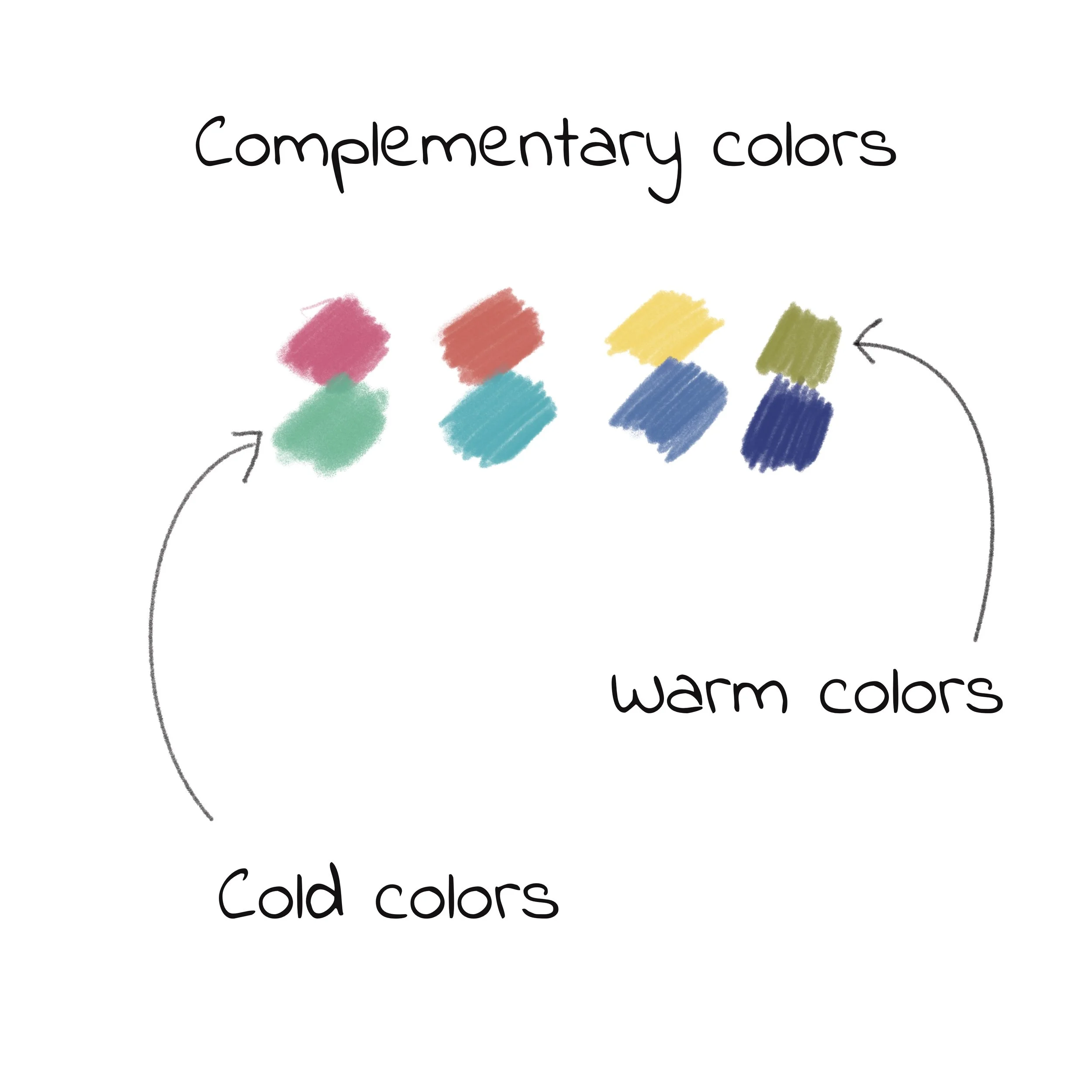
"Complementary colors are pairs found directly opposite each other on the color wheel, such as blue and orange, red and green, or yellow and purple. When used together, they create strong visual contrast and can make elements stand out. Artists and designers often use this contrast to draw attention to focal points, create dynamic compositions, or add vibrancy to a scene. However, it's important to balance them carefully — using one as the dominant color and the other as an accent — to avoid overwhelming the viewer."
— Source: Eiseman, Leatrice. “The Complete Color Harmony: Pantone Edition,” Rockport Publishers, 2017.
Color Choices: Primary and Secondary Colors in Are You Bored?
In Are You Bored?, I intentionally used a toned mix of primary colors — blue, purple, and green — to reflect boredom, stillness, and calmness. These show up in the character’s environment and clothing, helping to create a mood that feels relatable.
To balance that, I added vibrant secondary colors — green, orange, red, bright sky blue, and yellow — mostly in the background and supporting elements. These colors bring contrast, direct the eye, and add energy to each spread. Together, these palettes help reinforce the book’s core themes: imagination, creativity, playfulness, and the joy of ordinary moments.
“Choose warm, bright colors like red, yellow, and orange for playful or energetic stories to spark excitement and joy. Use cool tones like blue and green for calming, bedtime stories to create a peaceful mood. For magical or whimsical tales, purple and teal add a sense of wonder and fantasy, while earthy tones support more grounded or emotional narratives.”
— Adapted from principles of color theory in children's book illustration
“In visual storytelling, color choices are deeply intertwined with thematic intent. Specific hues can reinforce and enhance the emotional undercurrent of a narrative. For instance, yellow is often associated with themes of joy, optimism, and discovery, making it suitable for stories centered on play, exploration, or new beginnings. Blue, with its calming and dependable qualities, supports themes such as safety, reflection, or emotional resilience. Green, symbolizing growth and renewal, complements nature-based or developmental narratives. Red, being dynamic and intense, is frequently used in stories involving courage, urgency, or strong emotions. Purple lends itself to themes of imagination, magic, and transformation, while brown and other earth tones are ideal for grounding themes, realism, or stories with a rustic or nostalgic atmosphere.”
— Informed by color theory and narrative design in children’s literature

Quick tips for authors & illustrators:
Start with the tone: How should your story feel?
Choose 3–5 core colors and stick to them
Use complementary colors for contrast — but don’t overdo it
Keep character palettes consistent from page to page
Warm tones = energy & fun / Cool tones = calm & quiet
Use muted or dark tones to slow the pace or add depth
Test the palette in grayscale to check balance
Final Thoughts
Color is more than just a visual layer; it’s a tool to shape how the reader feels and how the story flows. When used thoughtfully, it adds clarity, mood, and meaning. In Are You Bored?, I used color to show how even the quietest moments can turn into something magical. And maybe, that’s where imagination really begins.
To see how I use the theory of color in practice have a look at my ‘Are You Bored’ book and subscribe to my YouTube channel.